Tiny Tales
This project was a mock design brief through Springboard intended to give students a taste of a GV design sprint. I adhered to the timeline as tightly as I was able in order to fully immerse myself in the experience and learn as much as possible.
Problem
TinyTales has encountered issues with parents not being able to find material to read to their children easily or quickly enough. As they have grown, the amount of books and other material has grown to the point that it is cumbersome to sift through.
Solution
Through search functionality and a filtering system that mirror’s the constraints parents need to work within (age, time available, subject matter), parents are able to efficiently find new stories that will engage and excite their children.
Role
For this project, my role was to use the research provided to me by Springboard and BiteSize UX for a fictional app called Tiny Tales and Ideate, Sketch, Prototype, and test a solution to a mock design brief.
Research
Primary research was provided by BiteSize UX for this sprint. From that research, I learned that there is no one-size-fits-all book. Parents don’t have lots of time to spend finding the right book, and therefore, the filtering system needs to be simple, efficient, and yet with enough information for parents to make informed decisions about what is appropriate for their children.
Parents often pre-screen books to make sure that it will be a good fit, but that can be a lengthy process of first finding the right type of book and giving it a scan to make sure it fits the bill. Finding a way for parents to narrow the options quickly while also having an efficient way to gain some context about the book would be helpful.
Day 1 - Experience Mapping
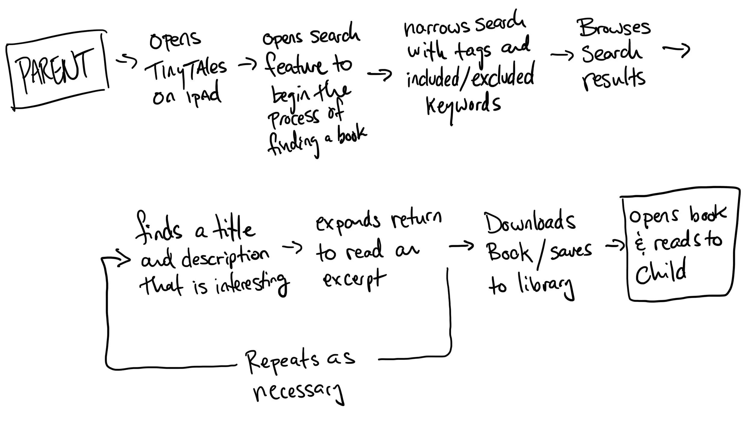
I set about mapping the experience from beginning to end to provide myself a framework for reference for sketching, ideating, and ultimately prototyping.
Day 2 - Inspiration and Sketching
My main inspirations were Amazon Video, Target, and Goodreads. Scrollable tiles within categories works well to quickly scan options, but a retail website filtering methodology is the best way to find the products you are looking for within certain parameters. I followed Goodread’s lead with the ability to preview a book before downloading, synopses, and reviews easily accessible.
“Crazy 8s”
Following the GV Sprint process, I then sketched Crazy 8s to quickly get ideas down on paper.
Solution
After looking back at my designs, I felt that there was a ninth option that didn't make it onto paper initially. This was actually a combination of my third and seventh sketches. The third sketch captured the visual filtering style I liked from the Target app, and the seventh captured the browsing style of Amazon Video. I combined these to create the basis for my design moving forward.
Day 3 - Storyboarding
Parent’s don’t have a lot of time to peruse new and interesting stories to read to their kids. They need to find books efficiently. So allowing them to filter by category, age range, and average reading time will help them decide what is appropriate for that moment, and then can scan the top few hits for something that will fit their needs. This ultimately reduces the time it takes to choose a book and gives that time back to spend reading and bonding.
Day 4 - Prototyping
This app needed to appeal to children, but also be functional for adults. The Tiles are book titles, but not book covers. I made this choice intentionally because so often we are drawn to a visually interesting cover, and skip over books with incredible content, so this helps put the content of all the stories on a level playing field. Results update as you change the filtering parameters, and you can add tags that may not be part of the simple filtering to help narrow down the options.
Day 5 - Testing
The results from my testing yielded some clear design flaws (listed in the table below), but overall the structure and flow of the app was intuitive for the users I tested with. The issues seemed to revolve around iconography, content of the filtering system, as well as the limitations of my prototype.
Final Thoughts
This project was a great introduction to the design sprint process. To get the most out of the experience, I stuck to the 5 day schedule, with the exception of user testing due to the fact that I was unable to schedule people for a single day.
I learned a great deal from this process, and at the end had two major takeaways. First, iconography continues to be an area that causes user confusion for my designs, and therefore an element of design that I will be focusing more on going forward. Second, building enough functionality into prototypes to allow users to move freely through a design is critical.


