Loggr
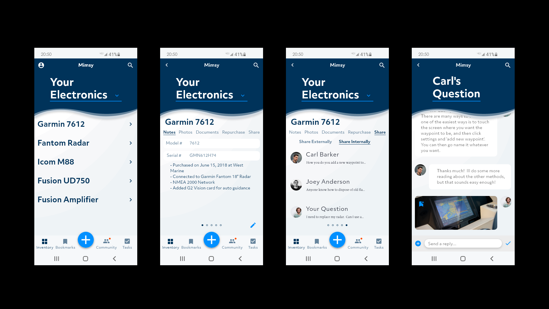
Loggr is a boat owner’s inventory management app which I created for my Springboard capstone project. After working many years in the marine retail space, I witnessed plenty of frustration surrounding identifying, sourcing, and purchasing new or replacement parts for boats.
Problem
Between virtually no standardization, boats changing ownership over their long lives, and a harsh environment, identifying and sourcing replacement parts can be a challenge.
Solution
So what are boat owners to do? Track their inventory for easy, efficient, and seamless replacement without the hassle of going to stores or researching online only to come up empty handed.
Role
For this Project, with guidance from my Springboard mentor, I was the sole designer from start to finish. I was responsible for primary and secondary research, ideation, sketching, wires, mockups, prototyping, and user testing. Primary tools used were Adobe XD and Google Suite.

User Profile
-
25-65
The age split among respondents to my survey were pretty evenly split from ages 25-65, but there were no younger respondents and those older than 65 no longer owned a boat.
-
86.7%
Of the people that responded to my survey, 86.7% were male.
-
73.3%
Roughly 3/4 of the people who responded to the survey owned either a cruising sailboat or cruising powerboat.
Understanding the User
Many users enjoy the challenge of digging into projects on their boats, however, the joy of owning a boat for many is to escape, so spending less time fixing their boat and more time on the water is very important. Unfortunately, they run into many challenges when performing maintenance, including identifying what needs fixing, how to get it, and finally making the repair. Each one of these steps creates its own challenges, and although many of the users mentioned enjoying a degree of challenge, many expressed frustration at some level.
Through my interviews, it became clear that many users tracked only a little bit of their inventory. I found this interesting as most expressed some frustration with the process of replacing items on their boat. What items and tasks they do track, are generally on notes apps, spreadsheets, or notebooks.
When faced with a product or part that they were unfamiliar with, they all use the same tool to begin their searches: the internet. Nearly everyone began their search with Google, but depending on their needs, their searches took them in different directions such as image searches, manufacturer’s websites, retail websites, and forums.
Affinity Mapping
Community is a major part of many users’ boating lives. Incorporating collaboration and community would be critical.
Boating is used as an escape and mental reset. Designing the app to be as unobtrusive as possible would be beneficial, because boaters want to spend less time fixing and more time boating.
Price, selection, and availability were the deciding factors in where and how users decided to buy what they needed. Providing flexibility and adaptability for each individual user’s needs would be important.
Personas
Ideation
How might we allow boaters to easily manage the things they need for their boat?
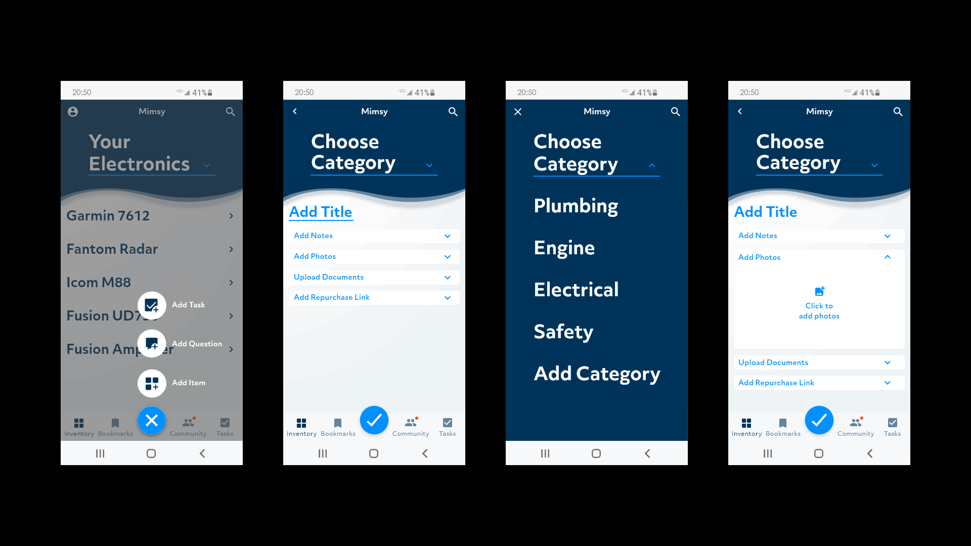
Allowing users to customize how and what gets entered, and organizing it how they see fit is critical to providing the flexibility for each user’s needs.
How might we enable boaters to find solutions to challenges they face?
I decided having a question and answer type section would enable users to not only get their own questions answered, but also share their knowledge and inventory with others, ultimately growing the general knowledge base, making the water a safer place, and enabling new connections between users.
How might we provide efficiency and flexibility in the purchasing process?
I originally felt that being able to link retailers to the app to make in-app purchases would be beneficial, but quickly realized the complication inherent here. I realized I needed to rein myself back here and keep things simple and flexible. Allowing users to copy and paste a direct link(s) to their preferred retailer(s) provides the flexibility they need depending on what factors are most important to each user for each particular item.
Sketches, Wires, and Visual Design
Because this was my first time translating abstract ideas into two-dimensional, interactive tools, I felt a bit directionless and struggled at this stage. However, after many rounds of rejected sketches, I started to home in on a general concept I thought worked well and began making wireframes.
As for the visual design, I chose to keep things relatively simple, using only different versions of blue, and a small splash of international orange to keep within the nautical theme of the design. I wanted the design to feel approachable, recognizable, and comfortable to boaters while still having a no-nonsense approach that reminds the user that this is primarily a tool.
Course Change
After getting to this point, I began to understand that this approach ultimately hindered me a bit as my screens became too dense and complicated, which undermined the design goals I had set in place from the start. It also became clear that so many images would cause overwhelming visual clutter.
I then reassessed my approach with some guidance from my Springboard Mentor. I stripped away unnecessary visual elements to allow more room for the design to breathe, which help earlier visual clutter. I also decided to use one font with different weights and size , rather than two, in order to be more cohesive, reduce confusion, and aid informational hierarchy. Finally, I reorganized the secondary navigation to allow for more efficiency when locating items within the inventory section.


Prototyping
Once my screens were defined, I set about building the prototype to test with users. Because this was my first time building a prototype, there was a bit of a learning curve. I had to make it interactive enough to feel real, but also working within my own skill set’s limitations. As my testing ultimately bore out, there were areas that caused some confusion that I learned from and improved upon during subsequent projects.
User Testing
Once my prototype was built, I defined the red routes I wanted to test with my users. During my testing, There were a few key issues that arose with my designs.
Issue #1
‘Ask a Question’ Button
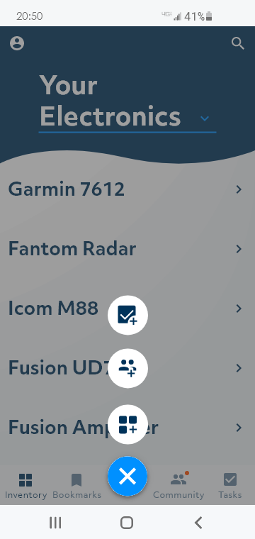
The first version utilized the icon from the community section with a ‘+’ to indicate adding. However, through testing, it was clear that this icon was ambiguous and confusing for users. I changed this icon to a speech bubble and added text for the second round of testing, and it was no longer an issue.
Issue #2
Sharing Flexibility
Users I tested with pointed out that they wanted more flexibility in the share feature such as certain item info and external sharing. I shifted it from the secondary navigation within the item page to an icon that would then allow internal, or external sharing with the ability to check the items that you would want to share.
Issue #3
Completed Tasks List
Users wanted to be able to see what they had accomplished, which helped them with organization and keeping track of projects. Prior to testing, tasks disappeared after the pop-up dialogue asking for confirmation of completing the task.
Final Thoughts and Reflections
After two rounds of testing, this project came out stronger, more efficient, more intuitive, and most importantly, more usable. However, that’s not to say there isn’t room for improvement. Being a very empathetic person, I felt I was able to really see the value in certain design choices from the user’s perspective. However, this project enforced the concept that even my own empathy can only take me so far, and testing, iterating, and understanding the user’s needs is really what shapes the product. Validating my own empathic assumptions was incredibly insightful. It surprised and delighted me how impactful seemingly small decisions, such as an icon, can be.
I have learned a great deal about the UX design process through this project, but there is still so much more to learn. Probably the most important thing I have learned is to dive head first into the process, and to trust where it takes you. Following the data to either nullify or validate your own intuition is critical to staying on track and not following a misleading path.
Thank you!


