Equipboard
Equipboard is an online database of musicians and the gear that they use to help inspire other artists. I, along with my project partner Katie Loebach, were paired with Equipboard as part of our Springboard Industry Design Project. This project was designed as a 4-week, 40-hour project, with the scope of the project determined by the partnership of the Springboard students and the Industry partner.
Problem
Equipboard self-identified their user experience and visual design as areas that needed the most help, however also admitted not knowing where to begin. We did a site analysis and determined a need for visual cohesiveness across pages, as well as more engaging navigational and organizational elements.
Solution
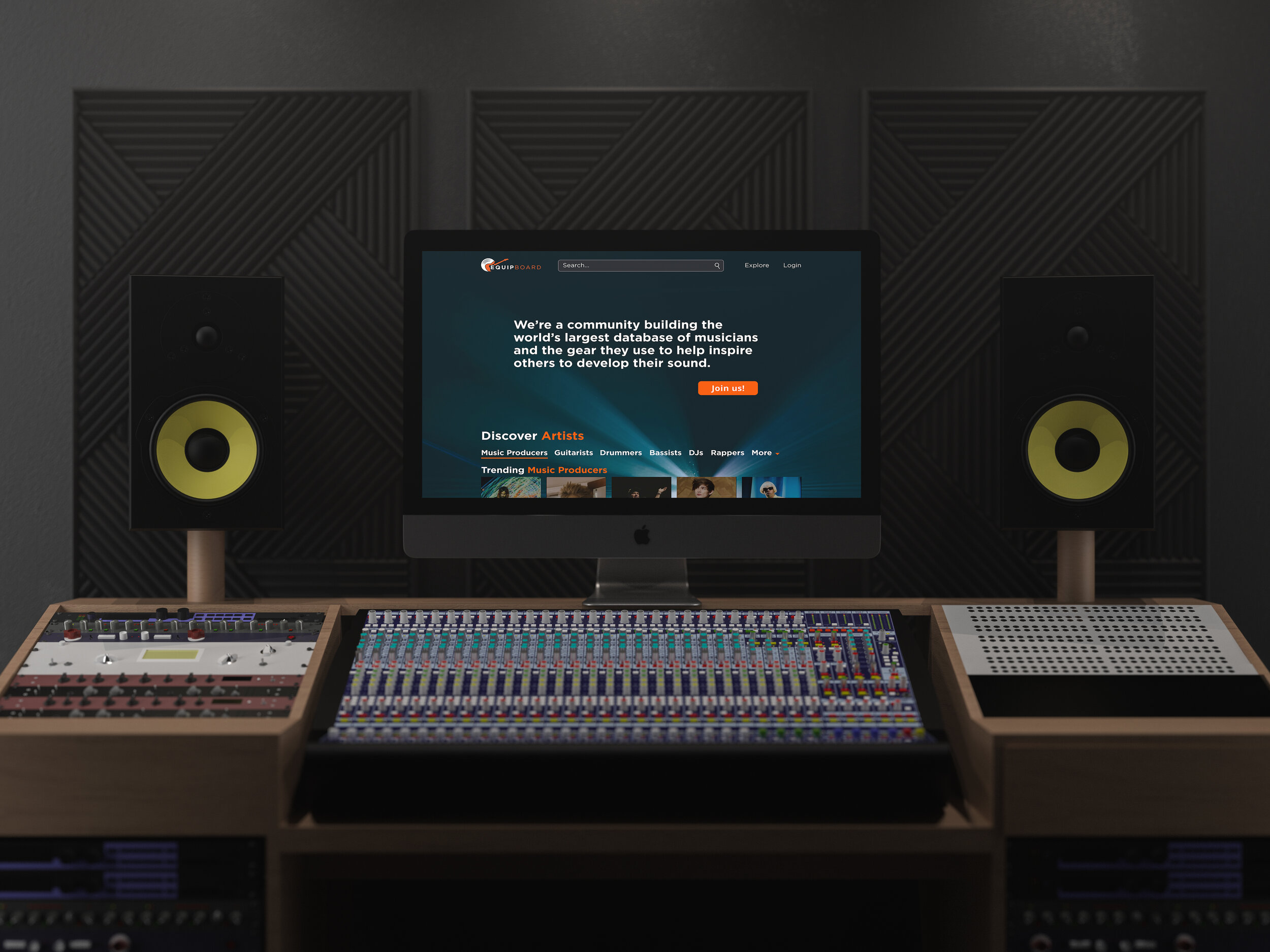
We gave the site a more modern visual design, while tweaking some important elements to help drive further exploration and engagement with the content.
Role
My Role within this project was to conduct quantitative research through Google Analytics and Hotjar heatmaps, as well as user testing to provide qualitative data as well. I used this research to inform my decisions from ideation sketching to wireframing and mockups.
Initial Site Analysis
From our observations, we determined that the site could use a more modern, clean, and cohesive design that would help instill confidence, trust, familiarity, and excitement about the product. There were many inconsistencies across the pages that, although subtle, led to some confusion between pages.
Research
Although we had a good idea of where to focus our attention, without research, we would be making educated guesses. In order to justify and inform our decisions, I did both quantitative and qualitative research.
Quantitative Analysis
Google Analytics showed me that we were on the right track with focusing attention on the artist and item pages because most users navigate between artist (called ‘Pros’) and item pages.
Google analytics also showed that pages were running slowly, which also bore out during user testing. There is a lot of content on each page, so I decided that it would be beneficial to reduce the amount of content on each page given that, according to Hotjar (see below), ‘See more’ buttons were well engaged with. By reducing the amount of content needing to load, while still giving the user the option to see more of each section, will help solve this problem.
6% of users engaged with the hamburger menu on the home page.
I proposed to get rid of the hamburger menu icon as it’s not immediately clear why it’s there, and move the content to the right under an ‘Explore’ navigation link in the header. This gives the user a clearer understanding of the purpose of the navigation link.
0.2% of users engaged with the ‘Add’ button in the header.
The ‘Add’ button is there to allow users to quickly add content to the site (because it is community driven), however, you need to sign up to add content. Without signing up, the add button only takes up real estate while providing no functionality for the unregistered user.
I proposed to move the ‘Add’ feature to the login/account button menu in the header once a user has signed up/in.
2.4% of users engaged with the ‘Get Started’ CTA on the home page.
The CTA was not particularly engaging, and took up the entire hero section of the home page with very few clicks.
I proposed to reduce the overall size of the CTA while using a more enticing message. Allow some of the content below the fold to be visible in order to encourage more scrolling.
Secondary navigation bars and ‘See More’ buttons were well engaged with across pages.
Users engaged with these quite well, which meant we could use these to our advantage to reduce page content.
I proposed to reduce multi-row content on artist page to allow faster loading while utilizing the ‘see more’ buttons to keep users exploring additional content.
Scrolling dropped off quickly compared to the length of the page, especially on the home page.
We needed to make the scrolling more efficient to allow users to see more content more easily.
I proposed reducing content to 1 row and keeping the ‘see more’ buttons readily available would allow for more efficient page scrolling/browsing.
Qualitative Analysis - User Testing
The next step was to test the existing site with users using a scenario designed to have them visit the various pages we were testing. Because of the time constraints, and people’s schedules, I was only able to accomplish 3 tests. However, I felt that this would give me enough to either bolster or disprove our assumptions and qualitative data. Ultimately, we discovered that we were on track with what we found through the qualitative research phase and our own initial site critique. From the tests, I compiled a list of critical, major, and minor issues with the site, which helped inform the direction we would take in our sketching and wireframing.
Critical Issues
Home page CTA was not clear, nor engaging enough.
Reduce the amount of information to absorb, rephrase with a more inviting and exciting call to action. Make it clear, concise, and enticing.
Major Issues
The item score is a source on confusion initially
A more clear link to the explanation of the score would be helpful. Possibly a text link rather than a very small question mark.
Price comparison is very much appreciated, but not immediately seen.
Consolidate the item information above the fold to make it more accessible.
The scrolling secondary navigation on the artist and item pages works on mobile, but it doesn’t function well on desktop.
Keep the scrolling (Swiping) on mobile, but change to s drop down expansion of options on desktop.
Minor Issues
The overall visual design, according to one user, was “cheap and boring”
In order to create a more modern and high quality feel, bring the dark theme from the home page to the other pages as well.
Ideation & Sketching
After compiling the research, Katie and I used the data to each create a series of sketches for the home, artist, and item pages. We decided that if we both ideated separately, we could come back together afterward and pick the best solutions from our sketches. What we didn’t expect was that our solutions were very similar, which encouraged us that we were on the right track.
Home Page
Smaller, more efficient CTA to allow content to show above the fold.
Eliminated the hamburger menu (later moved that content to an ‘Explore’ button within the header).
Moved the search feature from left to right where it would be more familiar (later changed to dedicated search field in the middle).
Artist Page
Changed card layout from two lines to one to reduce the length of the page (later changed to 4 cards and a ‘See More’ button).
Carried over the home page’s dark theme to the content below the artist description section to give visual continuity and cohesiveness.
Item Page
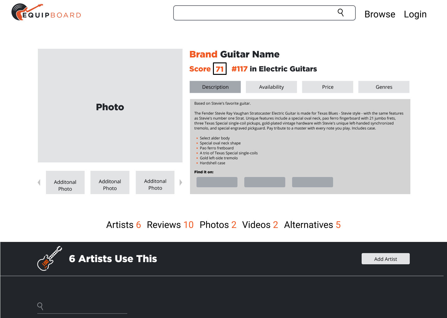
Reformatted the hero section content to bring some important information above the fold.
Make the link to understand the score more noticeable.
Wireframes
Maintaining visual cohesiveness with dark and light themes alternating between content changes helped create a modern visual cohesiveness. The other main differences were that the hamburger menu has been removed and the content has been placed within the ‘Explore’ navigation link, as well as the CTA hero section has been reduced in height to allow content to appear above the fold.
Home Page and Artist page by me, Item page Mockup by my partner, Katie Loebach
High Fidelity Mockups
Our next step was to bring the pages to life through high fidelity mockups. The first thing I tackled was to find a high resolution image for the home page background as the current image being used is very low resolution and gives it an unfinished, or rough, feeling. I then made sure to include elements from the style guide and existing item and artist imagery from the site.
Home Page and Artist page by me, Item page Mockup by my partner, Katie Loebach
Final Thoughts
This project was a real pleasure from start to finish. Michael, our contact from Equipboard, was easy to work with and provided great context to the business needs and limitations. Because they are a small company operating on a small budget, we knew that we needed to keep their business needs in mind, which is why we decided not to make any major changes that would create a lot of work for the person doing the development. We also felt honored that he trusted our instincts about where to focus our attention and allowed us the freedom to decide what the project would entail.
That being said, with such an open ended design brief, we found it a bit daunting at first to determine the scope of the project. However, once we determined what would have the biggest bang for the buck, we dove straight in. We found the subject matter to be interesting, exciting, yet also quite complex. During our conversations with Michael, we learned a great deal about how much data and material they need to manage, which makes this site a prime candidate for a much longer, more in depth design assessment. However, we believe that we were able to provide a solid foundation for further development within a visual design identity that brings their site into a more modern and polished aesthetic.


